Category: Interior Design

Strategic Architectural Design: Enhancing Productivity with an Open Concept Layout

Source:https://thearchitectsdiary.com

A few years ago, I was hired to remodel a 1980s suburban home for a couple who both transitioned to remote work. They were miserable, feeling stifled and disconnected. When I walked into their house, I instantly saw why: the floor plan looked like a giant waffle, chopped up into tiny, dark, claustrophobic cubicles by non-load-bearing drywall. They were literally working in silos, suffering from creative fatigue simply because their environment lacked flow.

As a builder with over a decade of hands-on experience swinging sledgehammers and configuring blueprints, I’ve seen firsthand how walls don’t just divide rooms—they divide minds. In the modern era of hybrid work and integrated living, spatial psychology is everything.

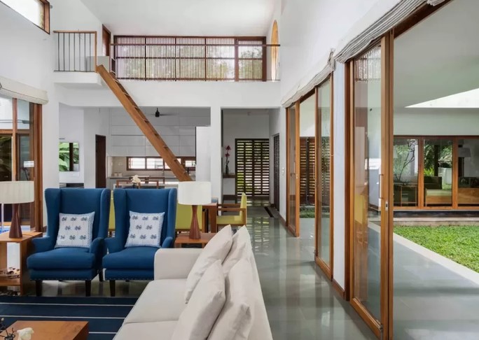
Transitioning your property into an open concept layout is about much more than just making a house look bigger. When engineered strategically, it can radically supercharge your daily focus, communication, and overall cognitive output.

Why an Open Concept Layout Changes the Productivity Game

Think of a traditional, segmented floor plan as a series of small, isolated software apps running simultaneously on your computer; each requires you to open a separate window, slowing down your system’s overall processing speed. An open concept layout, on the other hand, operates like an integrated dashboard. It allows natural light, airflow, and human communication to glide across your entire living ecosystem without friction.

When we break down physical barriers, we remove the mental friction that causes stagnation. In my years of executing structural reconfigurations, clients consistently report an unexpected side effect after the walls come down: they feel more energetic, less anxious, and significantly more motivated to tackle deep-focus tasks.

The Science of Light and Air Movement

It’s not just a placebo effect. There is hard technical data behind why fluid spaces boost human performance.

  • Daylight Harvesting: Eliminating interior partitions allows natural light from peripheral windows to penetrate deep into the core of the house, regulating your circadian rhythm and crushing afternoon fatigue.

  • Passive Airflow Regulation: Without micro-walls trapping stale air, your HVAC system distributes ventilation evenly, maintaining optimal oxygen levels that keep your brain sharp during long work blocks.

Architectural Engineering: How to Safely Remove the Barriers

For beginners and intermediate homeowners looking at a sledgehammer with ambition, let’s pause for a reality check. You cannot just blindly smash through drywall. Creating a successful open concept layout requires a firm understanding of your home’s skeletal structure.

Identifying the Load-Bearing Monsters

Before a single tool touches your walls, you must determine whether a partition is load-bearing (holding up your roof or upper floor) or merely a curtain wall (a simple divider).

Pro Tip: Look into your basement or attic. If a wall sits directly above a support girder, steel beam, or runs perpendicular to your ceiling joists, it’s highly likely a load-bearing wall.

Structural Substitutions: LVL and Steel Headers

To eliminate a load-bearing wall safely, you must transfer that heavy downward force to the foundation using horizontal engineering elements. This is where we swap wood studs for Laminated Veneer Lumber (LVL) beams or structural steel I-beams.

These headers span the newly opened gap, resting their immense weight on multi-ply jack studs at either end. It’s a precise calculation that requires an architectural engineer’s stamp, but the result is a completely unobstructed, seamless ceiling line.

+-------------------------+-----------------------------------+-----------------------------------+
| Structural Element      | Traditional Segmented Layout      | Modern Open Concept Layout        |
+-------------------------+-----------------------------------+-----------------------------------+
| Natural Light Profile   | Isolated to outer perimeter rooms | Evenly distributed core lighting  |
| HVAC Load Management    | Frequent micro-zones/stale spots | Uniform thermodynamic balancing  |
| Spatial Communication   | High audio/visual isolation       | Flexible, sight-line optimization|
| Structural Support      | Repetitive interior load walls    | Engineered LVL or Steel Headers   |
+-------------------------+-----------------------------------+-----------------------------------+

Zoning for Focus: The Art of “Broken-Plan” Design

The biggest mistake intermediate DIYers make when designing an open concept layout is treating the space like an empty warehouse. If you just throw a desk, a sofa, and a kitchen island into one giant room without a strategy, your productivity will plummet due to visual noise and echo.

To make an open space functional for work, you must implement what we in the industry call broken-plan design—using non-structural visual cues to define distinct functional zones.

Spatial Zoning Techniques

  • Acoustic Ceiling Drop-Downs: Lowering a section of the ceiling dry-wall over your designated home office zone by just a few inches creates a distinct “room within a room” feeling without adding walls.

  • Flooring Material Transitions: Run warm white oak engineered hardwood through your main workspace, but transition smoothly to a durable slate tile as you enter the kitchen zone. This tells your brain exactly when it’s time to work and when it’s time to rest.

  • Strategic Sightlines: Position your desk so your back faces the high-traffic kitchen area, and your view is oriented toward a window or a clean feature wall. If you can see dirty dishes from your workstation, your brain will constantly wander away from your actual tasks.

The Acoustic Echo Trap

When you remove drywall and carpeting to create an open space, you inadvertently create an acoustic playground. Sound waves bounce off hard surfaces like glass windows, quartz countertops, and hardwood floors, creating a hollow echo that ruins Zoom calls. Always budget for sound attenuation. Incorporate plush area rugs, heavy linen drapery, or decorative acoustic felt wall panels into your design to absorb stray decibels.

Technical Elements You Cannot Ignore

If you are planning to modify your floor plan, you need to think ahead about the hidden infrastructure buried inside those old walls. Over my 10+ years on the job site, mechanical rerouting is always the trickiest piece of the puzzle.

HVAC Supply and Return Lines

Walls often act as vertical highways for your heating and cooling ducts. When you pull a wall down, you have to reroute those bulky tin ducts. This usually means building a clean horizontal soffit along the ceiling or feeding the ductwork down through the floor joists to keep the sightlines perfectly clear.

Electrical Home Runs

Your home office needs clean, stable power. When opening up a space, make sure to plan for floor-mounted electrical outlets. If your desk sits out in an open zone away from perimeter walls, the last thing you want is a hazardous, ugly extension cord stretching across your main walking paths.

Investing in Your Cognitive Environment

Ultimately, home improvement shouldn’t just be measured by the resale value it adds to your property—it should be measured by how effectively it improves your quality of life. An engineered open concept layout breaks down the physical and psychological barriers that slow down your day. By welcoming daylight, maximizing structural flow, and zoning your spaces with intention, you turn your home into an absolute powerhouse of daily productivity.

Over to You!

Are you currently working in a cramped, walled-off space, or are you planning a renovation to open things up? What structural challenges are holding you back from making the leap? Let’s talk about your floor plan goals, structural beam concerns, or zoning ideas in the comments below!
Corporate Identity Branding: Defining Space with Statement Light Fixtures

Source:https://whitehillsinterior.in

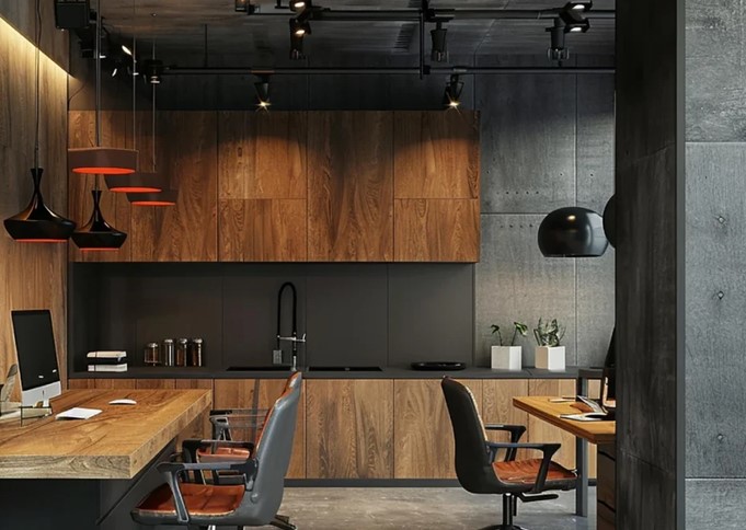
A few years ago, I walked into the newly redesigned headquarters of a tech startup that prided itself on being “disruptive, transparent, and collaborative.” Yet, as I stood in their reception area, I was greeted by standard, buzzing fluorescent troffers and a cheap, generic flush-mount fixture. The space felt like a DMV waiting room, completely contradicting everything the company claimed to be. It was a classic case of identity crisis, written in lumens.

When we talk about corporate branding, we often think of logos, color palettes, and slick websites. But as someone who has spent over a decade knocking down walls and redesigning commercial spaces, I can tell you that your physical environment is your most honest billboard.

If walls could talk, lighting is the voice they use. Let’s dive into how you can use statement light fixtures to translate your corporate identity into a tangible, physical experience.

Why Lighting is the Unsung Hero of Corporate Identity

Think of your commercial space as a tailored suit. Your furniture and paint colors are the fabric, but statement light fixtures are the luxury watch or the custom cufflinks. They are the focal points that draw the eye, command attention, and tell people exactly who you are before you even shake their hand.

In my 10+ years of home and commercial improvement, I’ve noticed a major shift. Companies are moving away from sterile, cookie-cutter offices and leaning into “resimercial” design—blending residential comfort with commercial functionality.

Lighting is the easiest way to bridge this gap. It does more than just illuminate a desk; it establishes your brand’s psychological tone.

The Psychology of First Impressions

When clients or prospective talent walk through your doors, they form an opinion within seconds.

  • A sleek, geometric LED pendant screams cutting-edge innovation and precision.

  • An organic, woven rattan installation tells the world your brand values sustainability, warmth, and human connection.

  • An oversized, industrial-iron chandelier projects a heritage brand rooted in strength, history, and reliability.

Strategic Placement: Where to Make Your Statement

You don’t need an unlimited budget to overhaul your entire building. In fact, over-lighting a space with too many bold pieces creates visual chaos. Over the years, I’ve found that strategic placement in high-impact zones yields the highest return on investment.

1. The Reception Area: Your Brand’s Handshake

The lobby is where the magic needs to happen. This is your premier opportunity to deploy a massive, jaw-dropping architectural fixture. If your brand identity is bold and forward-thinking, this is where you install a custom linear light sculpture that guides the visitor’s eye directly toward the reception desk.

2. The Main Conference Room: The Power Play

The boardroom is where big decisions are made and major deals are closed. A generic panel light just won’t cut it. Instead, opt for an elongated statement light fixture that mimics the shape of your conference table.

Pro Tip: A large rectangular or oval pendant hanging directly over the table anchors the room, focuses attention inward, and eliminates harsh shadows on people’s faces during crucial face-to-face negotiations.

3. Communal Hubs and Cafeterias: The Culture Catalyst

If your corporate culture values collaboration and creativity, your breakrooms and casual meeting spaces should reflect that energy. Here, you can play with multiple, smaller statement pendants clustered together, or fixtures with vibrant accent colors that match your brand’s secondary color palette.

+------------------+-----------------------------+----------------------------+
| Space            | Recommended Fixture Type    | Brand Message conveyed     |
+------------------+-----------------------------+----------------------------+
| Reception Lobby  | Oversized Architectural     | Bold, Innovative, Credible |
| Conference Room  | Elongated Linear Pendant    | Focused, Professional, Apex|
| Breakroom / Hubs | Clustered Minimalist Spheres| Creative, Collaborative    |
+------------------+-----------------------------+----------------------------+

Technical Know-How: Balancing Form and Function

As an expert, I cannot stress this enough: a gorgeous light fixture that provides terrible light is a failure. You must balance aesthetics with technical performance. When choosing your branding illumination, keep these three technical factors in mind:

Color Temperature (Kelvin)

The color of your light dictates the mood of the room.

  • 2700K – 3000K (Warm White): Best for hospitality, cozy breakout rooms, or brands that want to feel deeply welcoming and intimate.

  • 3500K – 4000K (Cool White): The sweet spot for productivity, focus, and modern corporate environments. Anything higher than 4500K starts looking like a dental clinic—avoid it.

Color Rendering Index (CRI)

Always look for fixtures with a high CRI (90 or above). CRI measures how accurately a light source reveals the true colors of objects beneath it. If your corporate brand relies on specific, vibrant brand colors on your walls or furniture, a low CRI light will make them look muddy and washed out.

Layering Your Light

A statement piece is the ambient or accent hero of the room, but it shouldn’t work alone. You need to layer it with functional task lighting (like recessed directional downlights or under-cabinet LEDs) to ensure employees can actually see their work without straining their eyes.

Pitfalls to Avoid in Commercial Lighting

Throughout my career, I’ve had to rescue many clients from expensive DIY lighting mistakes. Here are the hidden traps you need to look out for before signing off on a purchase order:

  • Ignoring the Ceiling Height and Scale: The most common mistake is buying a fixture that is way too small. A tiny pendant in a cavernous atrium looks like an afterthought. Conversely, a massive fixture with a low drop-down clearance will turn your hallway into an obstacle course. Always map out the dimensions in 3D before buying.

  • Forgetting About Maintenance: I once saw a company install a magnificent, multi-tiered crystal-and-glass statement fixture over a 20-foot stairwell. It looked breathtaking until six months later when three bulbs burned out and the glass gathered dust. No one had a ladder long enough to reach it safely. Think about how you will clean the fixture and change the bulbs before you install it.

  • Skipping the Dimmers: Never install a statement fixture on a simple on/off switch. Corporate spaces are dynamic. A room that hosts a high-energy morning workshop might host an evening cocktail mixer or a projector presentation. Always integrate your statement lighting into a dimmable system.

Illumination as an Asset

Your office isn’t just a place where people sit at computers; it is a physical manifestation of your company’s mission, culture, and value. Investing in high-quality, strategically placed statement light fixtures is one of the most effective ways to elevate your space from ordinary to unforgettable.

When you align your lighting design with your corporate identity, you create an environment that inspires your team, impresses your clients, and silently communicates your brand’s excellence every time the switch is flipped.

Let’s Elevate Your Space

What does your current office lighting say about your brand identity? Is it time for an upgrade, or are you trying to figure out the right scale for your next renovation project? Drop your thoughts, layout challenges, or questions in the comments below—I’d love to help you map out your next design move!

Maximizing Luxury Real Estate: Strategic Design of the Walk In Closet

Source:https://murphydoor.com

Imagine stepping into your master suite after a grueling business trip. You open the doors to your dressing area, only to be greeted by a chaotic avalanche of mismatched hangers, dark corners where expensive tailored suits go missing, and a complete lack of breathing room. Instead of a calming sanctuary, your high-end space feels like a cluttered stockroom.

Over my 10+ years of remodeling luxury homes, I have noticed a fascinating shift in what buyers actually care about. High-end countertops and smart toilets are great, but a poorly engineered dressing space can completely sink a luxury property’s appraisal and emotional appeal.

I once consulted on a multi-million dollar estate that sat on the market for nine months. The culprit? A massive, yet completely unoptimized master wardrobe area that looked like a cavernous, empty drywall box. We stepped in, re-engineered the spatial layout, and turned it into an architectural masterpiece. The home sold three weeks later.

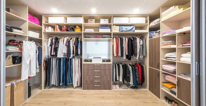
A premium walk in closet is no longer just a place to hide your clothes. It is an experiential asset, a personal boutique, and a high-yield investment in your property’s equity. Let’s peel back the layers on how to design this space with true professional precision.

Architectural Ergonomics: The Golden Ratios of Closet Design

When beginners approach closet design, they often make the mistake of focusing purely on aesthetics—like choosing wood finishes or decorative hardware. True luxury, however, is born from ergonomics. If the physical measurements are wrong, the space will never feel premium.

The Standard Clearance Blueprint

Think of your custom wardrobe layout like a high-traffic highway. You need designated lanes to ensure smooth transit and zero bottlenecks.

  • The Single-Sided Walkway: If you have cabinetry on one wall only, your walkway must be a minimum of 36 inches wide to allow an adult to move freely.

  • The Double-Sided Island Layout: If you plan to incorporate a center island, you need at least 36 to 40 inches of clearance on all sides between the island and the perimeter cabinets to comfortably open drawers and cabinet doors.

  • Depth Precision: Standard hanging clothes require a minimum depth of 24 inches. Anything shallower means your expensive jackets and blazers will constantly scrape against the back walls or get pinned by closing doors.

Spatial Flow Metaphor

Designing a high-performance walk in closet is exactly like configuring a high-end kitchen work triangle. You need a logical, fluid transition from the “raw storage” zone (hanging rods and deep shelves) to the “processing” zone (drawers and jewelry trays) to the “final inspection” zone (full-length mirrors and vanity lighting).

Smart Zoning: Mastering Long-Hang, Short-Hang, and Open Shelving

An amateur layout treats every square foot of wall space equally. A veteran designer analyzes your specific wardrobe inventory before drawing a single line on a blueprint.

[Top Level: 12-15" Depth]  ---> Seasonal Storage / Luggage
[Mid Level: 24" Depth]     ---> Double Hanging Rods (Shirts / Pants)
[Lower Level: 14" Depth]   ---> Angled Shoe Displays with LED Strips

1. The Power of Double Hanging

Most of your wardrobe consists of shorter items like button-down shirts, folded trousers, and skirts. By installing double-hanging rods—one at 40 inches from the floor and the second at 80 inches—you instantly double your usable vertical storage real estate.

2. Dedicated Long-Hang Allocations

Never skip the long-hang section. Maxi dresses, trench coats, and evening gowns need a clean drop of 60 to 65 inches to prevent the fabric from bunching up on the baseboards.

3. Open Shelving vs. Glass-Front Cabinets

Open shelving is perfect for chunky knits, sweaters, and designer handbags because it makes your daily choices highly visible. However, for a truly elevated look, integrate glass-front cabinet doors with soft-close hinges for your absolute highest-value items. It gives the space that upscale, curated boutique vibe while keeping dust completely at bay.

💡 Pro Tip: The Integrated Valet Rod

Always incorporate at least two retractable valet rods into your cabinetry trim. These hidden metal rods slide out seamlessly when needed. They are the ultimate operational tool for planning your outfits the night before, staging dry cleaning, or packing for an upcoming trip.

Illuminating the Wardrobe: Technical Lighting Design

You can buy the most expensive white oak cabinetry in the world, but if your color temperature is wrong, your navy suits will look black and your cream dresses will look washed-out yellow.

Mastering the Color Rendering Index (CRI)

In luxury home improvement, we never use cheap, standard light bulbs in dressing areas. You must look for LED fixtures with a CRI of 90 or higher. A high CRI ensures that the artificial light mimics natural sunlight accurately, allowing you to see the true, vibrant colors of your textiles.

The Three Layers of Light

To eliminate all shadows and make your walk in closet glow like a luxury showroom, you must install three separate layers of light:

  • Ambient Lighting: A central flush-mount fixture or an elegant chandelier that sets the overall mood and aesthetic tone of the room.

  • Task Lighting: Dedicated recessed spotlights focused directly over the mirrors, vanities, or island packing zones.

  • Accent/Intrabox Lighting: Hidden LED tape lights (ideally 3000K to 3500K temperature) routed into the vertical side panels of your shelving. This illuminates your shoes and clothing from the front rather than the top down, casting zero unwanted shadows.

The Structural Overlooks That Ruin Custom Closets

Before you kick off your luxury build or renovation, you must account for these hidden technical dangers that often catch intermediates completely off guard.

  • HVAC and Air Stagnation: Closets are packed tight with organic materials like wool, leather, and cotton. Without proper air circulation, these spaces become breeding grounds for musty odors and humidity. Always ensure your HVAC system includes a dedicated supply vent and return air path within the room.

  • The Weight-Bearing Trap: Modular DIY closet organizers are often anchored solely into drywall using plastic anchors. A single foot of tightly packed hanging clothes can easily weigh up to 30 pounds. True luxury cabinetry must be mechanically fastened directly into the structural wood wall studs or onto a heavy-duty steel suspension rail system.

  • Window Fading: Natural light looks beautiful, but direct UV rays will mercilessly fade and discolor expensive fabrics over time. If your dressing space has a window, apply a high-grade UV-blocking architectural window film or install automated blackout shades.

Conclusion: Crafting Your Personal Sanctuary

Transforming a simple storage space into a high-impact, luxury walk in closet requires a deliberate marriage of structural engineering, spatial ergonomics, and premium lighting design. When executed correctly, it does more than just organize your daily life—it acts as a powerful selling point that dramatically boosts your home’s market value.

Are you preparing to design a custom dressing suite from scratch, or are you looking to optimize an existing layout that just isn’t performing well? Leave a comment below detailing your current spatial dimensions, and let’s architect the perfect custom layout for your home!

High-End Aesthetic Branding: Incorporating Copper Kitchen Decor for Visual ROI

Source:https://wearepapilio.co.uk

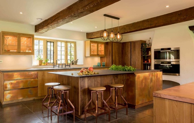
You walk into a kitchen that cost sixty thousand dollars to renovate, yet somehow, it feels cold, clinical, and entirely forgettable. The stainless steel appliances are sleek, the white quartz is pristine, but the “soul” of the room is missing. Now, imagine that same kitchen, but with a warm, rosy glow reflecting off the backsplash—a set of hand-hammered canisters on the counter and a reclaimed copper pot filler over the stove. Suddenly, the room has a pulse. It feels expensive, curated, and intentional.

In my decade of overseeing residential flips and high-end kitchen remodels, I’ve learned that the secret to a high “Visual ROI” (Return on Investment) isn’t always the biggest appliance. It is the strategic use of Copper Kitchen Decor. Copper is the only metal that can simultaneously feel rustic, industrial, and ultra-luxurious. It is the “jewelry” of the kitchen infrastructure, and when applied correctly, it brands your home with a signature of quality that stainless steel simply cannot match.

The Psychology of Warmth: Why Copper Outperforms Chrome

Most modern kitchens are dominated by “cool” tones. We have blue-gray cabinets, chrome faucets, and silver-toned hardware. While clean, this palette often feels uninviting. Copper acts as a thermal balancer for the eyes.

I remember a project in 2024 where the client was insistent on an all-white “minimalist” kitchen. It looked like a laboratory. I convinced them to swap the cabinet pulls and pendant lights for Copper Kitchen Decor accents. The change was tectonic. The copper “anchored” the white space, making it feel like a home instead of a hospital wing.

The Analogy: The Gold Watch of Interior Design

Think of copper like a vintage gold watch worn with a simple white t-shirt. The shirt is functional and clean, but the watch tells the world you appreciate history, craftsmanship, and a bit of flash. In the kitchen, copper tells guests that this isn’t just a place to boil water; it’s a space where culinary art happens.

The Technical Specs: Understanding Copper Grades and Finishes

Before you start buying every shiny orange object you see, you need to understand the material science. Copper in the kitchen isn’t just about color; it’s about Metallurgical Integrity.

1. Lacquered vs. Living Finishes

This is the most critical technical decision you will make.

  • Lacquered Copper: These pieces are sprayed with a clear, protective coating. They will stay shiny and “new” forever. This is great for high-up decor like pendant lights that are hard to reach.

  • Living Finish (Unlacquered): This copper is raw. Over time, it will develop a Patina—a layer of oxidation that turns the metal deep brown, purple, or even green. For true high-end branding, a living finish is superior because it shows authenticity.

2. Gauge and Weight

In the world of Copper Kitchen Decor, thickness matters. If you are buying a copper farmhouse sink or range hood, you want a 14-gauge or 16-gauge thickness. Anything thinner (like 20-gauge) will sound “tinny” and dent easily. High-quality copper feels heavy; it has a density that you can feel the moment you touch a cabinet handle.

3. Antimicrobial Properties

Here is a technical fact often overlooked: Copper is naturally Oligodynamic. It possesses a self-sanitizing surface that kills 99.9% of bacteria within two hours of contact. In a post-pandemic design world, incorporating copper touchpoints (like pulls and faucets) isn’t just an aesthetic choice—it’s a functional health upgrade for your kitchen infrastructure.

Strategic Placement for Maximum Visual Impact

You don’t need a copper-plated kitchen to see a return. In fact, “less is more” is the professional mantra here. To maximize your Visual ROI, focus on these three “High-Impact Zones”:

  • The Eye-Level Horizon: Pendant lighting over an island. Copper reflects light in a warmer spectrum than LED-white, making food look more appetizing and skin tones look healthier.

  • The Tactile Zone: Cabinet hardware and faucets. Because copper is a soft metal to the touch, it feels “warmer” (literally, it conducts heat better) than cold steel.

  • The Backsplash Focal Point: A copper range hood or a set of hanging copper cookware. This creates a vertical “anchor” that draws the eye upward, making the ceiling feel higher.

Technical LSI Keywords for Your Sourcing List

When shopping for professional-grade Copper Kitchen Decor, keep these terms in mind to avoid “copper-colored” plastic fakes:

  • PVD Coating (Physical Vapor Deposition): A high-tech process used to give stainless steel a copper look that is incredibly scratch-resistant.

  • Hand-Hammered Texture: Provides a faceted surface that hides fingerprints and water spots better than polished copper.

  • Tarnish Resistance: A chemical treatment applied to some mid-range decor to slow down oxidation.

  • Verdigris: The specific green pigment that forms on copper over decades—highly sought after in “Antique” branding.

Expert Advice: The “Hidden Warning” on Maintenance

I’ve seen many homeowners fall out of love with copper because they didn’t understand the maintenance cycle. If you buy a polished copper sink, it will show water spots. It is a high-maintenance material.

Pro Tip: If you love the color of copper but hate the maintenance, look for “Oil-Rubbed Bronze” with “Copper Highlights.” This gives you the warmth of the orange metal with the durability of a dark, stable finish.

Expert Advice: If you choose a living finish, embrace the “imperfection.” The beauty of copper is that it tells the story of your kitchen. The spots where you splash lemon juice will turn bright, and the spots you rarely touch will turn dark. It’s a dynamic, changing canvas.

Never use abrasive cleaners or ammonia on copper. You will strip the finish or, worse, cause a chemical reaction that leaves the metal looking cloudy and “burnt.” A simple microfiber cloth and mild soap are all you need for 90% of your copper decor.

Integrating Copper with Other Materials

For a truly modern look, don’t match your metals. The “mixed metal” trend is here to stay because it feels more organic and less like a “showroom set.”

  • Copper + Navy Blue: This is a classic high-contrast pairing. The orange tones of the copper “pop” against the deep cool of the blue.

  • Copper + Natural Wood: If you have walnut or oak cabinets, copper blends into the wood grain, creating a “Warm-on-Warm” aesthetic that is incredibly cozy.

  • Copper + Matte Black: This is the “Industrial Chic” standard. The black provides a sharp, modern frame for the glowing copper accents.

Conclusion: Investing in the “Glow”

Incorporating Copper Kitchen Decor is about more than just buying a new teapot. It is a strategic design move that increases the perceived value of your home. By understanding the difference between gauges, finishes, and LSI-grade materials, you transition from a “decorator” to a “home curator.” You are building an environment that doesn’t just look good in photos but feels substantial in person.

Are you ready to add a “living finish” to your home, or do you prefer the permanent shine of lacquered accents? I’ve seen both work wonders in different architectural styles. Drop a comment below with your current cabinet color, and let’s figure out the best way to introduce some copper warmth into your space!

Sustainable Light Management: Architectural Depth via Bamboo Window Blinds

Source:https://velablinds.com

The afternoon sun is brutal. It’s that specific time of day when the glare hits your monitor at a perfect 45-degree angle, turning your home office into a panoramic mirror and hiking your cooling bill by 20%. You reach for those standard white plastic slats, and with a depressing clack-clack-clack, you’re suddenly sitting in a dark, sterile box. You’ve solved the glare, but you’ve killed the soul of the room.

In my decade of traversing job sites and consulting on interior retrofits, I’ve realized that most people treat window treatments as an afterthought—a “utility” to be checked off a list. But when we talk about Bamboo Window Blinds, we aren’t just talking about a cover-up. We are talking about a high-performance, organic light-diffuser that adds layers of architectural texture while maintaining a carbon-neutral footprint.

The Organic Light-Engine: Beyond Simple Shade

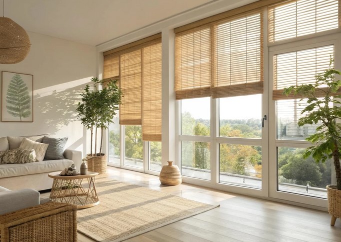
When you install a set of Bamboo Window Blinds, you aren’t just blocking light; you are “sculpting” it. Unlike synthetic materials that create a hard line between light and shadow, the natural irregularities in bamboo fibers create a soft, dappled glow.

Think of it like the difference between a harsh spotlight and the light that filters through a forest canopy. The former is clinical and flat; the latter has depth, movement, and warmth. In one project for a mid-century modern remodel, we replaced heavy velvet drapes with woven wood bamboo shades. The transformation was instant—the room felt three times larger because the light was being “invited” in rather than just “locked” out.

The Sustainability Factor: A Rapidly Renewable Resource

I’ve always been a stickler for material life-cycles. Bamboo is technically a grass, not a wood, and it can grow up to three feet in a single day. When we specify bamboo for a project, we are choosing a material that reaches maturity in 3–5 years, compared to 20–50 years for traditional hardwoods. For the eco-conscious homeowner, this is the ultimate “guilt-free” luxury.

Engineering the Window Envelope: Technical Standards

To the untrained eye, bamboo blinds look like simple sticks tied together. To an expert, they are a complex assembly of Woven Wood engineering designed to resist environmental stress.

1. Dimensional Stability and Warp Resistance

One of the primary technical reasons I recommend bamboo over traditional wood slats is its Tensile Strength. Bamboo fibers are naturally designed to bend in high winds without snapping. In a window setting, this translates to incredible warp resistance. Even in high-humidity areas like kitchens or bathrooms, high-quality bamboo maintains its structural geometry far better than basswood or faux-wood alternatives.

2. Thermal Resistance (R-Value)

Bamboo is naturally hollow and porous at a microscopic level. These tiny air pockets act as a thermal break. When Bamboo Window Blinds are lowered, they create a dead-air space between the window pane and the room. This adds a layer of insulation that can significantly reduce Solar Heat Gain, keeping your interiors cooler in the summer and trapping heat in the winter.

3. Light Filtration vs. Blackout Capacity

Bamboo blinds come in various “weaves.” A loose weave offers a view-through effect (perfect for living rooms), while a tight weave provides significant privacy. For bedrooms, we often use a “Dual Shade” configuration—bamboo on the front for the aesthetic, and a fabric privacy liner on the back.

Technical LSI Vocabulary: The Professional Spec Sheet

When you are sourcing Bamboo Window Blinds, look for these technical descriptors to ensure you are getting architectural-grade quality:

  • Kiln-Dried Bamboo: This process ensures the moisture content is stabilized, preventing mold and future shrinkage.

  • Edge Binding: A fabric border sewn onto the edges. This isn’t just for looks; it prevents the reeds from fraying over time.

  • Cordless Lift System: Modern safety standards (ANSI/WCMA) dictate that cordless is the way to go, especially in homes with children or pets.

  • Valance Integration: A matching bamboo header that hides the mechanical headrail and mounting brackets.

Expert Advice: The “High-Traffic” Trap

In my ten years in the field, I’ve seen one recurring mistake: installing low-grade bamboo in high-traffic sliding doors without a Top-Down Bottom-Up mechanism.

Pro Tip: Because bamboo is a natural material, it has weight. On very wide windows, a single large blind can become heavy and difficult to operate daily. I always recommend splitting wide windows into “Two-on-One” headrails. You get two independent blinds that look like one continuous piece, reducing the strain on the lifting mechanism and extending the life of the hardware by years.

Not all bamboo is treated for UV resistance. Raw, untreated bamboo will “sun-bleach” over 24 months, turning from a rich amber to a pale straw color. Always verify that your blinds have been treated with a UV-Inhibitor coating during the manufacturing process to preserve the architectural depth of the color.

The Analogy: The “Linen Suit” for Your House

Think of your windows like a person’s wardrobe. Plastic blinds are like a polyester uniform—functional, but they don’t breathe and they look “cheap” under close inspection. Bamboo Window Blinds are like a bespoke linen suit. They have a natural “slub” and texture that feels expensive because it’s imperfect. They breathe, they adapt to the temperature, and they get better with age as they develop a slight patina.

Installation and Maintenance: Protecting the Investment

Installing bamboo blinds is a straightforward process, but the “Depth” of the mount is critical.

  • Inside Mount: This requires a window casing depth of at least 2 inches. It provides the cleanest architectural look, as the blinds sit flush with the wall.

  • Outside Mount: If your window frames are shallow or unattractive, mounting the blinds on the wall above the window can make the window appear much taller than it actually is.

Maintenance Note: Never use “wet” cleaning methods on bamboo. Since it is a porous grass, excess water can cause the fibers to swell. A simple vacuum with a brush attachment once a month is the industry standard. For deep cleaning, a slightly damp microfiber cloth with a drop of lemon oil will restore the luster without compromising the fiber’s integrity.

Conclusion: Lighting the Path Forward

Choosing Bamboo Window Blinds is a move away from the “disposable” culture of home improvement. It is a strategic choice that balances thermal efficiency, sustainable sourcing, and a timeless aesthetic. You aren’t just covering a hole in the wall; you are installing a functional piece of art that changes the way you experience the passage of time throughout the day.

Does your current window setup make your room feel flat, or are you looking to add some organic texture? I’ve seen bamboo work in everything from ultra-modern lofts to cozy cottages. Drop a comment below with your window dimensions or your current color palette, and let’s figure out which weave is the perfect “filter” for your home!